Evaluation
-
When I see the progression of my proposal form the consistent intentions seem to be concerning my portfolio. My main objective of this module was to produce work which represents what I want to do and what relates to the people I am addressing it to. Changing and tuning my briefs to cater for this was a fantastic learning curve.
A talk with Fred in around the third week jolted my design brain for the best. He highlighted the fact that I was going into briefs using the image I wanted to produce as the solution to the problem in the brief. I needed to realise and sharpish that this cannot be. The image should be a bonus to the solution or the way I translate my solution as a designer. I needed to stop going to briefs with a resolution in my head already. I was forming briefs out of 'I want to make some watches' or 'I want to draw this and that'. I needed to stand back and work out what I didn't want to produce first as well as putting the content before the aesthetic.
Brief one moved from Olympic watches to glittery wallpaper. I found out dangerously late that I had been lying to myself about what I wanted out of the brief. It moved from Olympic merchandise to a book of ideas to a complete content change to designing a range of wallpaper for Habitat. This was a good decision and I am happy with the way I grabbed the bull by the horns and reacted quickly. What was bad was that it took me too many weeks to realise this. I feel like I will be able to recognise and avoid this a lot better in my FMP. The work I ended up producing for that brief came out well considering what I wanted to achieve.
The brief was set to experiment with image making processes and to produce a chunk of work for my portfolio to fill a much needed gap for potential employers. There is always something more I could have done or another ay of trying something but I had to draw a line and set myself small deadlines to make sure I didn't produce a lump of rushed wallpaper and no attempt of making a product out of it with the way it was packaged. I think that this was another positive step for me. I spent time considering in a deeper level the way I wanted to package the wallpaper. I am never normally I fan of packaging and don't have much confidence in it. However, I think that the resolution I proposed had some potential in it and I would like to revisit it in my own professional development as a freelancer.
Brief three, National Trust's Silly Walks was another learning curve for me. During the same talk with Fred I was shown how to completely strip something down and stop bashing out work with no focus to it. I came out fairly happy with the skills I had developed and the new perspective I had on image. I produced designs where the content was put first and the image was customised to the content rather than the content to the image. I was designing the image with the context in mind, ie. developing the image making process to make it applicable to the brief itself. My drawing moved from twee to a more useable and applicable style.
Brief two, Brownies Centenary was probably the hardest of my briefs. I found deliverables very hard to allocate at first. I had the same problem as before of already having a deliverable in mind and ignoring questioning it's relevance. I lost a lot of time in this and it was damaging my stamina and work morale. However, I tried to make a bigger effort with research and surprised myself with actually finding a potential problem or gap in their organisation. I allocated a centenary day plan and brain stormed along side their morals and objectives as a group to find deliverables for that. I think that this worked well and I felt satisfied that I was producing something for a real reason.
However, a talk with Lorenzo threw me back over the edge a bit as issues were raised which should have been raised a long time ago. I had forgotten about producing a product instead of a 'group of stuff'. I had to produce some packaging in a few hours and didn't do the best I could have done if I had tackled this earlier. Another point was bought up which made me question my whole design direction. I was told to 'make sure there is still design in there'. I had used a large illustration turned into felt as part of the packaging but I don't think that this was considered all around as design. I began to question everything I had made for this module and still now feel a little unsettled as to the meaning of design and the 'ticking of the boxes' of this course.
Smaller briefs such as Dickens and Penguin showed me how much I enjoy both quick turnarounds as well as the versatility of my designing. It taught me not to restrict myself too much with the work I produce when I leave. It encouraged me to think about freelancing and showed me how much I would love to win the Penguin competition. It has slightly panicked me of my plan when I leave university as I now know that I enjoy more things than pattern design. I feel as though I have taken a step backwards as to knowing where I could go when I leave as I don't want to restrict myself too much and feel uninformed of possible places to go that would include or benefit from my work.
However, I feel happy with the level of work I have put in. I can say with confidence that I don't think I could have worked too much harder. I feel as though I have worked consistantly too. I think that I started working well in the way that I hit the ground running and was bashing out work since day one (despite blips and wobbles). Yes, I felt rushed at the end at some points but it was in a way of more suggestions cropping up in my head rather than covering things I had left to the last minute.
I think that this module has set me up really well for my FMP. I think that it will be easier to spot potential problems in chosen briefs and I will be able to analyse my time management with more awareness. I also feel as though I have a few portfolio pieces and am looking forward to having them judged my professionals shortly.
14/12/2011
13/12/2011
12/12/2011
10/12/2011


09/12/2011


08/12/2011
RESPONSE
-important
had a cat with Lorenzo after this crit and he pointed out something that has ben at the back of my mind for the last month or so. I stupidly have been ignoring it but infact it is so importantly correct and neccessary.
When showing my Brownies boards and asking about the image repetition problem he voiced the problem of having a large group of small things but no whole package as a prduct as the impact sum up shot. That is to say that I had made lots of little things but how would they be distrubuted and used as a product?
So considering I have set myself a deadline of friday to submit my boards it was a matter of hours to produce some packaging. I had to think fast and in tune with my brief. This wasn't a time for belly bands. It had to be something that a 7-11 year old would love and want to take to school with them. So I decided to further the felt imagery theme and try this... (below).
However, once catching up with Lorenzo to show a quick proposed resolution to the problem, it was said that make sure there is some design in there. This might be completely and utterly true. However, I was left a little confused in the way that what is design? If I have been spending the last three months churning out image to solve problems and for branding, where is the line? Because the image is made of material and used on packaging-is that still design?
Another quick mock up made in the hours before boards deadline. Baring in mind I had to reshoot I was VERY panicked when making this. However, another completely necessary comment from Lorenzo. I hadn't pushed it into a product. However, on reflection and after printing and re photographing-the label was necessary but the barcode wasn't! I forgot the context and forgot that this was a free bee- not a product to be scanned and bought.
However, despite the mocked up paper choice I think it was important for me to make these changes. If anything to show myself that it's never too late and its SO important to take these extra steps in products instead of student work.


distribution
-
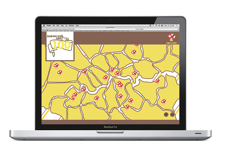
I made a quick mock up of what the link would look like from the Brownie homepage. It needed to tie into the main webpage without having a massively contradicting style-hense the size I chose as the link. I think it stands out well as a one off centenary event and would like to try and further this if I have time to other web banners etc.


-
I made a quick mock up of what the link would look like from the Brownie homepage. It needed to tie into the main webpage without having a massively contradicting style-hense the size I chose as the link. I think it stands out well as a one off centenary event and would like to try and further this if I have time to other web banners etc.


06/12/2011
getting the wallpaper rolls white
-
 this was SUCH a disaster. I had a flap and bought more paint and paint brushes-and then decided to scrap this idea and mock it up with a paper covering to try and make a smoother finish. In a perfect world there would be no covering and they would be matt white-doing woodworks slit in the tube justice.
 this was SUCH a disaster. I had a flap and bought more paint and paint brushes-and then decided to scrap this idea and mock it up with a paper covering to try and make a smoother finish. In a perfect world there would be no covering and they would be matt white-doing woodworks slit in the tube justice.
05/12/2011


02/12/2011
review quotes to turn into potential content heads
-
Its a film that divides opinion and has got the world talking about art cinema
you're left with a genuinely moving and original coming-of-age memoir
Terrence Malick’s The Tree of Life feels very much like the kind of cosmic spectacle that most good, law-abiding citizens will get to see just once in their lifetime.
After fooling around with this for a few minutes I realised this is completley not what I want to do. Why don't I create a range in my brief by creating all of the covers. Just because they only want one-doesnt mean I can only submit one.


stock testing and additional prints
-


although the photos might not show it-the ink sits surprisingly well on antique white, thank goodness! I didn't want it to splurge out like on newsprint.


Subscribe to:
Posts (Atom)